Click to hide the solution
Click to see a more comprehensive solution
Click to hide the solution
|
Lines
of best fit.
|
||||||||||||||||||||||||||
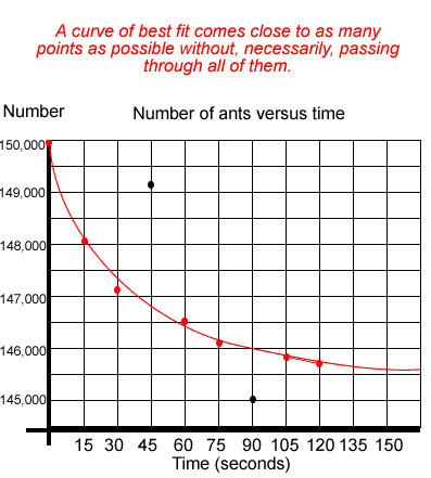
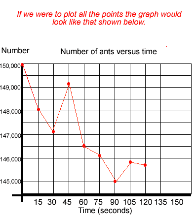
| Sometimes one or two results may be way off the mark for some inexplicable reason. These results are ignored when drawing the graph. Sometimes the graph is represented by a line of best fit. It can be straight or curved. That is to say a line that comes close to as many points as possible, without necessarily passing through all the points, is drawn. | ||||||||||||||||||||||||||
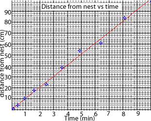
The graph on the left shows the distance an ant is from its as it travels in a straight path away from its nest. Distance is plotted against time. A line of best fit is drawn. Note that it does not go through all the points but comes close to as many points as possible. Sometimes a straight line may not be the best option, as is obvious when you click to see the graph. A curved line might be best as a line of best fit. |
 |
|||||||||||||||||||||||||
|
Consider an experiment where Begong insecticide was tested on an ant colony. A three second spray of Begong was applied to the nest and the ants that were still alive were counted every 15 seconds. The table on the left represents the data collected. Graph the results and draw
a line of best fit. Is there any data that should be ignored when graphing the data. |
|||||||||||||||||||||||||
|
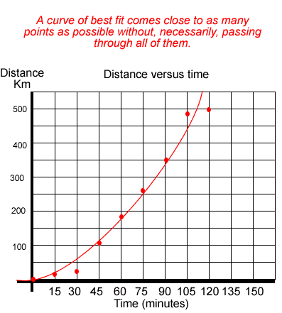
A car travels in a straight line away from home. The distance is recorded every 15 minutes and the results are presented in the table on the right. Plot a line of best fit to represent the data. Solution |
|
|||||||||||||||||||||||||